
Structure of an ideal landing page or homepage
Irresistible Landing Pages: Building Landing Pages That Demand Attention and Drive Results.
 By Luis Alfredo — Founder, Menta Experts
First, it is important to differentiate if a home page is a landing page? To answer this question, it is important to first define what a landing page is. A landing page is essentially a page that a potential customer arrives at through various means (Google, social media, emails, etc.) and is specifically designed to fulfill a particular goal, especially in marketing.
That being said, a home page can often be a landing page.
A home page is not considered a landing page when its primary purpose is to provide an overview of the website and facilitate navigation to different sections. However, the foundation that we are going to see today can be used for the home page of a website and additional sections can be added depending on the client's needs.
In fact, within the same website, other pages, such as specific service pages, can be built using this landing page structure.
Without further ado, let's begin with the breakdown of each section of a landing page, but first, let's understand two important terms:
Above the fold: This refers to what is visible when a landing page is initially opened, the first screen that the potential customer sees. It is generally known as the "Hero" section.
Below the fold: This refers to what the user sees once they start scrolling.
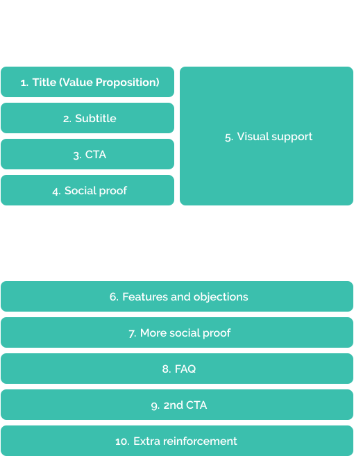
Structure of a landing page [1]
Above the fold
The most important section of all, here your potential customer will decide whether to continue on your page or not. This section needs to be well-analyzed. It should have captivating content for your audience and a design that exudes professionalism and trust. Users make a decision within 3 to 5 seconds whether they will stay on your website or not.
1. Title (value proposition)
Perhaps one of the most challenging tasks is to come up with a unique, concise, memorable value proposition that specifically addresses your target audience. It is the precise expression of the set of benefits or values that customers will receive to meet their needs. Here is a more comprehensive article we wrote on how to create a value: link.
In simpler terms, you can consider the following three tips:
When you have a unique product: Explain it in the easiest way possible. Example: Netflix - Thousands of TV shows & movies. Entertainment guaranteed. Example: Uber - Your ride, just a click away.
When your product is not unique: Many products or services are not unique. In this case, a good hook adds strength. The easiest way is to write hooks that address the biggest objection of your customer (Value + Objection). For example: "You don't have to be an SEO pro to rank higher on Google" or "Ace the TOEFL with just 10 minutes of studying per day".
Niche proposition: Another approach is to carve out a niche with your value proposition. For example: "How Small Brands Sell More Online", "The All-In-One Toolkit for Working Remotely".
2. Subtitle
Here, you can be more specific. Explain how it generates value in the potential customer's life. Example: Title: How Small Brands Sell More Online; Subtitle: Privy's conversion, email marketing, and text messaging tools help you get more customers from your traffic.
3. CTA (Call to Action)
Help the user quickly fulfill the goal of your page. The most common CTAs are "Sign Up," "Start Trial," etc.
Call to Value: Emphasize the value rather than the action in your buttons; these generate more conversions. Example: Record podcasts in studio quality → CTA: Start recording.
Objection handle: Add a few more words to your CTA to address the main objection of your customer to clicking. For example: "Start Free! No CC required", "Try Prisma in 5 minutes", "Get started for just $1".
Lead Capture Form: It is recommended to keep the form as short as possible. However, this may vary if you are a B2B company that offers a high-value product or service and wants to pre-qualify leads in advance. In that case, you can include more fields, but it is not recommended to exceed 5 fields.
4. Social proof
Social proof in this first section adds instant credibility. You can display logos of brands you have worked with, the number of projects or downloads, review scores, customer face photos, among others.
5. Visual proof
The idea is to show something as close as possible to what you are selling. Showcase your product, or even better, a video of your product in action.
Below the fold
In the Above the fold section, you capture the attention of the potential customer. In the Below the fold section, you convert that attention into a purchase.
6. Features and objections
Here, you need to explain in more detail the features of your product, how it benefits your potential customer, and what the main objections are. This section can be the longest and most comprehensive. Group all the main objections and use their own words to highlight them. For example, the objection "It is hard to use" can be answered with "So simple Grandma can use it"; "The setup is hard" with "Guests join with just one click"; "I suck at tech" with "We built this for non-techies".
7. More social proof
In the previous section, we included a snippet of social proof to gain credibility. Here, we aim to inspire action. Use testimonials from your current customers that reinforce your value proposition. You can use more data, such as the number of satisfied customers, completed projects, countries, NPS (Net Promoter Score), etc.
8. FAQ (Frequently Asked Questions)
Include all the features and objections that were not suitable to address earlier.
9. 2nd CTA
Here, remind the customer why they should click.
10. Extra reinforcement and/or footer
Finally, leave the potential customer with a story that helps and reinforces everything mentioned before. It could be a letter from the founder (with a photograph). A suitable structure for the letter is: put yourself in their shoes, explain the problem, take ownership, and give a happy ending.
Conclusion
All the aforementioned content should be supported by an interface design that captivates potential customers. Seek support from expert agencies in web design and development that can provide further guidance. If you're interested, Menta would be happy to assist you.
In summary, the structure is as follows:
- Title: Explain the value you provide.
- Subtitle: Explain how you'll create it.
- CTA: Indicate the next step for the user.
- Social Proof: Make it believable.
- Visual support: Help them visualize it.
- Features and objections: Support your product/service.
- More social proof: Encourage them to buy.
- FAQ: Answer all objections.
- 2nd CTA: Remind them what to do.
- Extra reinforcement and/or footer: Address any remaining doubts.
References
[1] My step-by-step guide to landing pages that convert, Marketing Examples. Available at: link
[2] Perfect landing page design explained (in 5 minutes) (2022) Flux Academy. Available at: link


